September 23, 2020
Wenda's new Brand Identity
In the last few months we at Wenda have sailed on a route marked by several changes, which has led us to some fascinating landings!
We want to present our new Brand Identity as a butterfly coming out of its cocoon presents itself to the surrounding world, and with the same lightness we want to illustrate the reasons of this transformation.
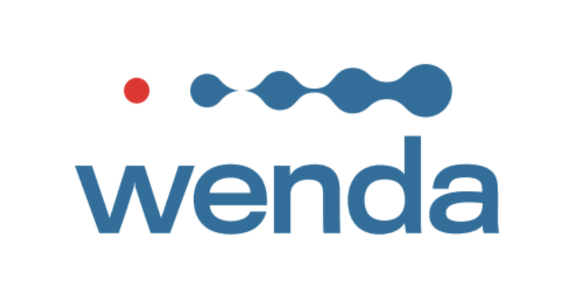
Wenda has a new logo, consisting of a graphic sign placed above the name.
The red circle represents the customer's product, and to highlight its uniqueness and value it is separated from the rest of the logo. That red circle also expresses a reference to the REC or LIVE symbol, to emphasize Wenda's constant monitoring of the supply chain.
The blue pictogram, depicted with a pseudo-circular and wavy shape, indicates the principles of connection, continuity and dynamism characteristic of the product movement along the supply chain. With the increasing gradualness of the figures we wanted to communicate the progressive strengthening of connection and collaboration in the supply chain. We have chosen to use the color blue both to emphasize Wenda's focus on traceability and temperature control - an essential condition for the preservation of sensitive products - and to evoke technology in general and digitalization in particular.
In the text section we used the same blue color that fills much of the graphic sign, and we rendered it with a linear and solid font to reflect the spirit of reliable digital service embodied by Wenda. The result is a fairly soft, slightly rounded font chosen to recall the shapes and curves of the WENDA symbol.
The color choices aim to maintain and fuel a precise dynamic balance between the parts of the logo, and respond to the desire to retain color continuity with the previous brand: red is passion, production, dynamism; blue is connection, digital, cold and hot chain.
But Wenda's new visual identity extends beyond the logo!
We have also made a revolution in both the aesthetics and content of our website: we want to tell our uniqueness and our success stories with a contemporary and analytical approach, showing in depth the functionality of the Wenda Platform and the solutions to control, manage and share data related to temperature and Food traceability in cold and hot supply chains.
To achieve these goals, we have set up an impressive graphic restyling and navigation operation, and on this last point we want to spend one more word: Wenda also means relationships, so we decided to make the user experience of our website more concrete, dynamic and fast, to the full benefit of the people who will visit this space.
Last but not least... We have implemented on the new website the possibility to try a demo of the Wenda Platform in less than 30 minutes.
We strongly believe in the value we produce, and we will be happy to show you directly the benefits that Wenda can generate for organizations of different sizes and types.
